Why did you decide to include a color blindness mode in your game?
In Details Information About color blindness mode in your game?


As it happens, having dedicated so much time and hard work relying on my eyes in order to guide art on a computer screen, my vision was affected, and on came the glasses along.
Just then, something finally dawned on me – the experience of living life, continuing to dig for intriguing experiences with limited eyesight.
The realization immediately expanded into a general sense of empathy and obligation to those that have challenges with their vision.
We then recently redesigned our entire approach at Cloudburst to accommodate those with specific visual needs by doing things like making all of our text, and icons larger – sometimes by about 30% larger.
Rather than testing the waters and asking some users if they need accommodating visual adjustments, I decided, we need to take care of everyone, and so we made the larger size a default for all.
Surprisingly, that single adjustment improved our revenue by a whopping 50%! At that point I realized just how potentially large the community is, and how those who have visual limitations might be missing out on most apps because of that.
Unfortunately, the vast majority of apps don’t “get it”, disregarding eyesight considerations issues when designing theirgames.
Wanting to continue our ever growing commitment to people under the belief that everyone deserves a great experience, we discovered that the biggest community of potential users are the colorblind.
In fact, 8% of the population among men are colorblind.
Then, all of a sudden, I remember my own colorblind uncle Jerry, and nephew Michael.
I realized that the colorblind community is our community, and my family, and so went to straight to work on adding robust colorblind support.
How did you go about creating the color blindness mode
He was very helpful and offered to handle all my graphic design issues. With much gratitude, and thanks to the awareness brought by my own eyesight issues check your eyesight issues, I wanted to completely dive into the experience and make an app that accommodated this community without bargain; with Tom’s thumbs up, I began development.
My first attempt was lackluster. We hired a graphic designer and made the classic graphic designer move: making all the patterns perfect for desktop but way too small for mobile screens.
We realized, this wouldn’t be good enough for the community we were looking to cater to. What’s more, the patterns were not perfect.
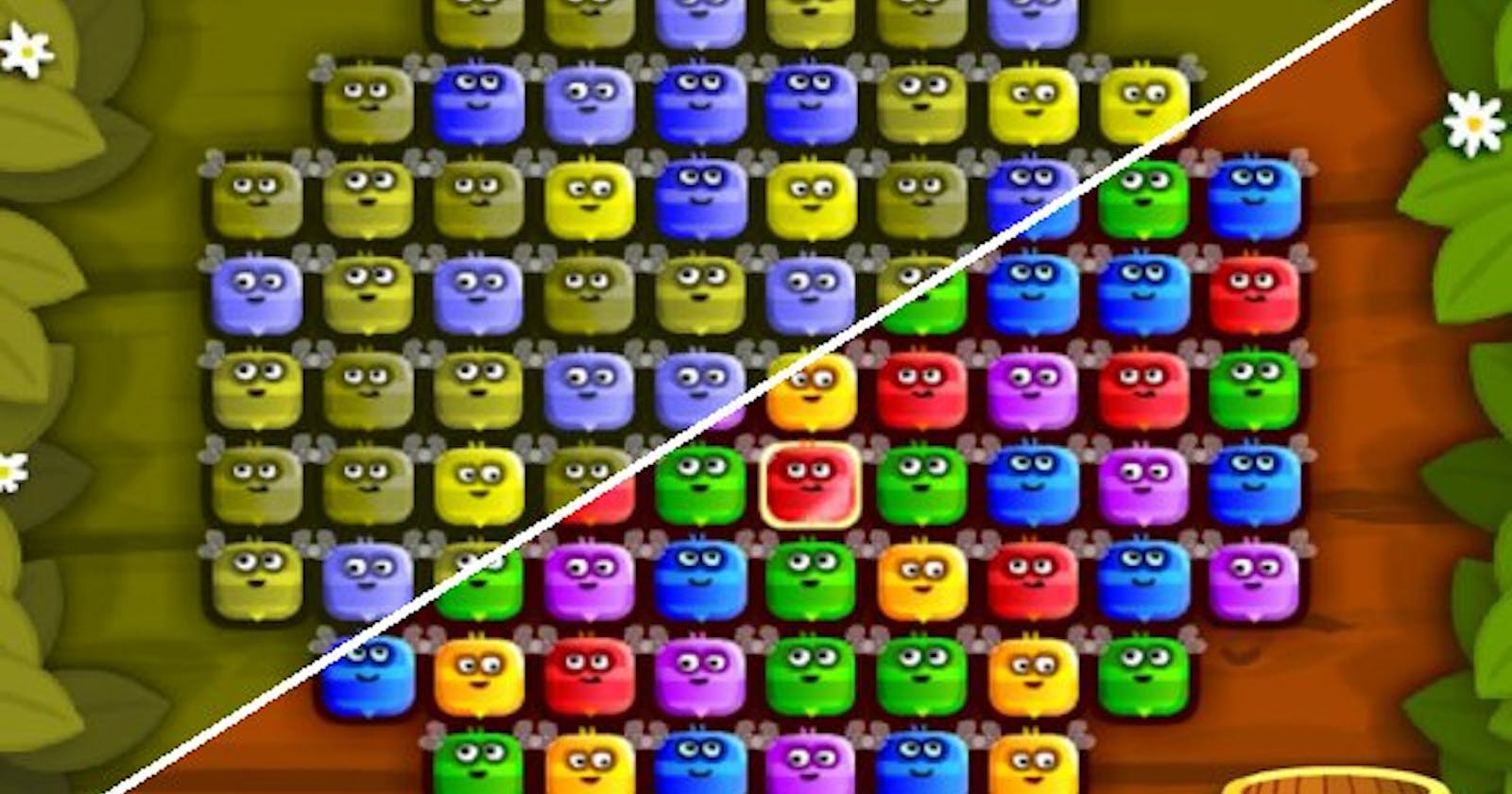
Why patterns? A colorblind user won’t benefit from colors, so patterns make a better fill for objects of the puzzle that need touching and capturing–things like stripes, plaids, checkers, and so on.
The other important element is to make sure that the contrast between light and dark in each individual pattern is stark enough so it makes it easy for the gamer to behold the difference.
We’ve put a lot of time working and thinking around the needs of the colorblind test . We want to show that this community matters, and hopefully inspire a larger trend from other developers.